UX & UI Design
Brand Design
WordPress Development
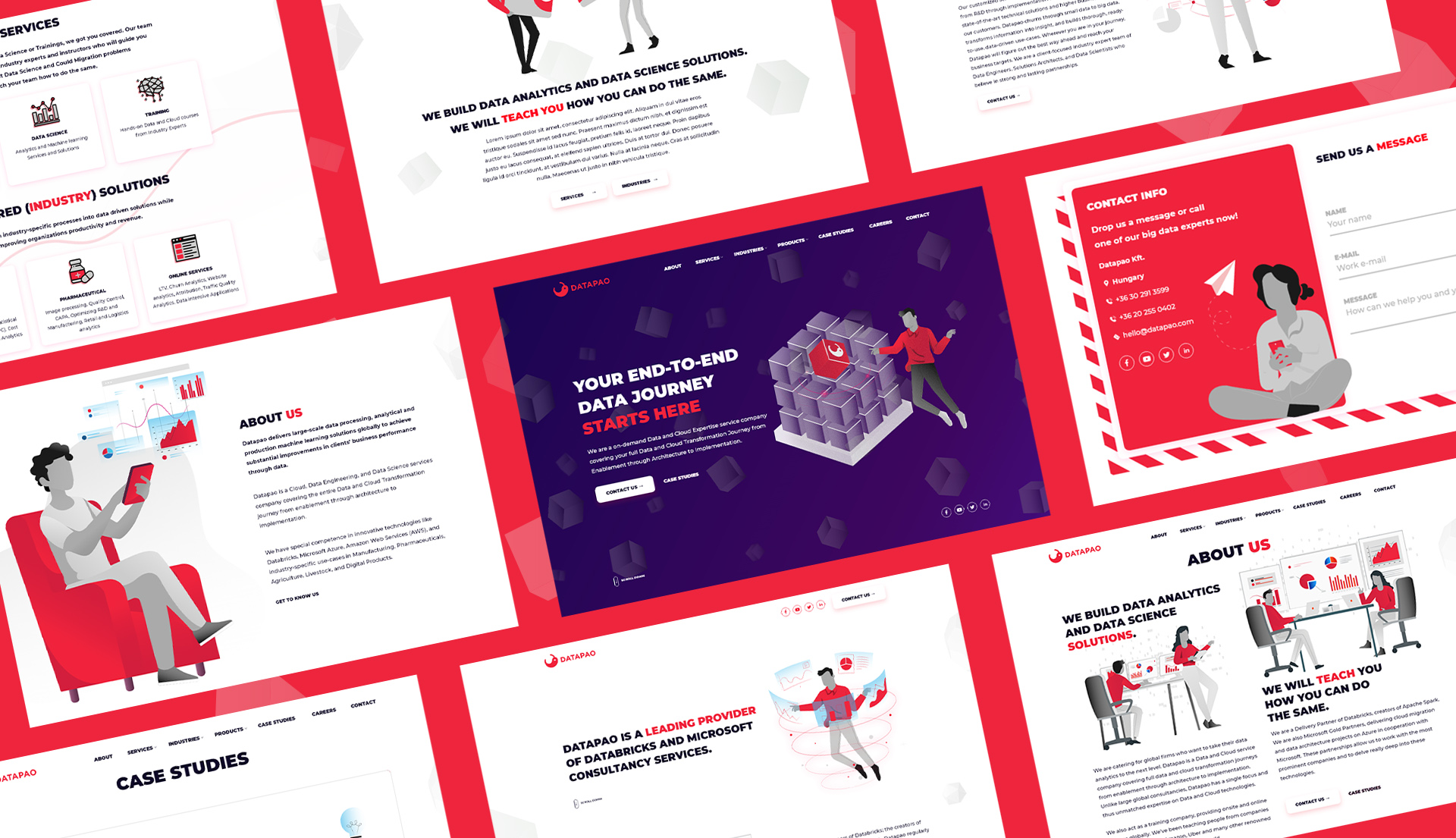
Datapao needed a website that would reflect the quality of their services. We did just that, and the stunning, custom branded WordPress site really speaks for itself.
Datapao is an on-demand data and cloud expertise service company – covering the full data and cloud transformation journey from enablement through architecture to implementation. They wanted to refresh their brand to illustrate the high-quality nature of their services.

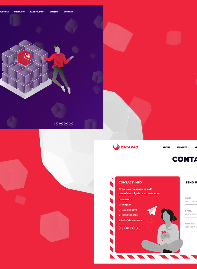
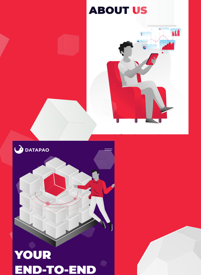
The visual theme of the website is based on the company’s profile: the cubes represent the data that surrounds us in the digital world. Datapao makes it possible to navigate and organise data and to use it effectively.


Creating professional yet exciting designs for an industry such as this is no easy task. Our designers expertly married the two concepts together, avoiding the website being too boring or too abstract.
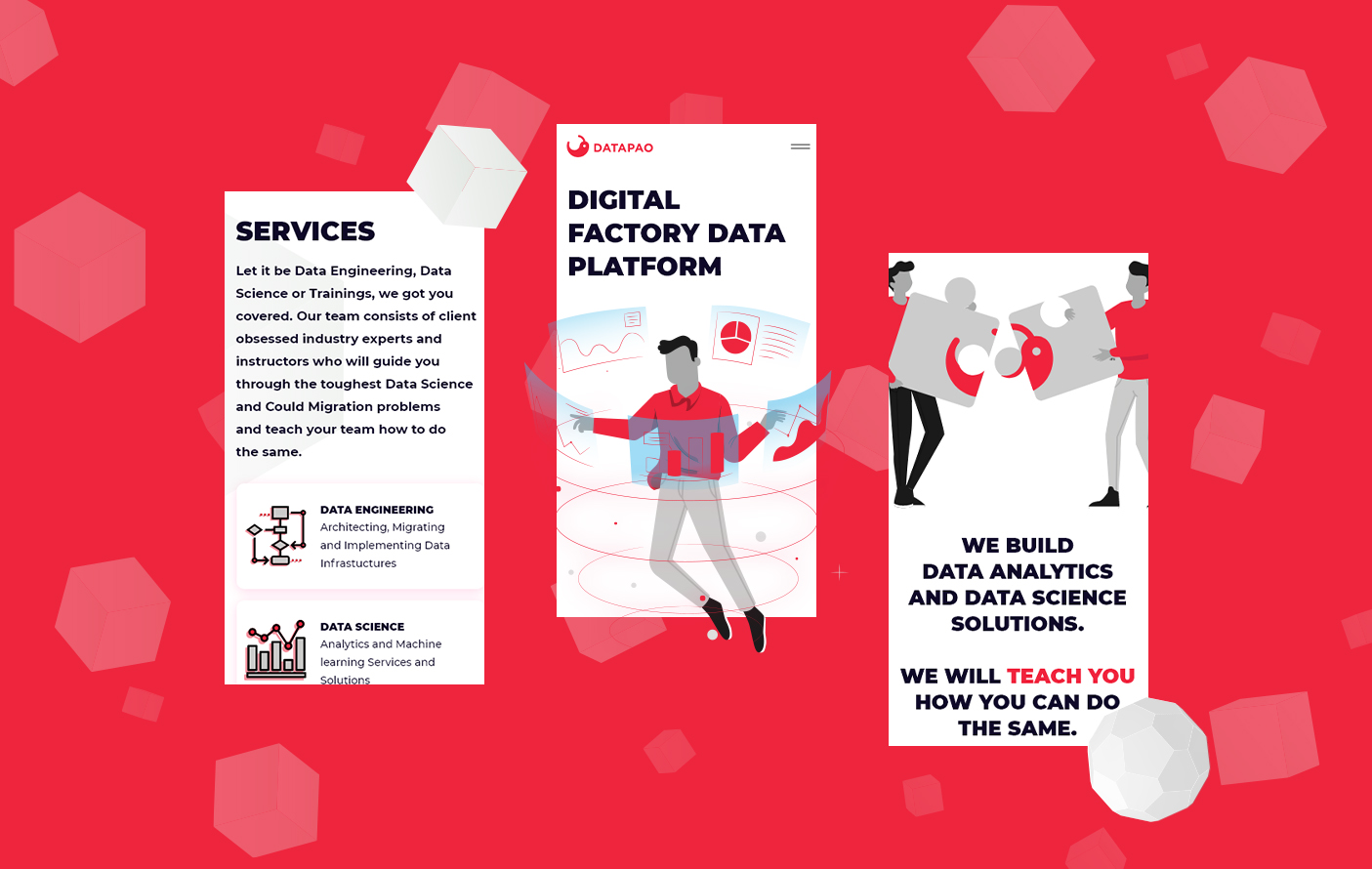
The website features spectacular animations and thematic, clean, creative illustrations (UI elements) to keep the visitor’s interest. To keep the professional feel of the website, our designers stuck with monochrome and brand colors, made exciting by more “noisy” textures. The colors and layouts help keep the pages fresh and interesting.
The combination of visual uniqueness and high quality content ensures that visitors will remember the Datapao brand.

 Reworking 3 of Forbes’ websites
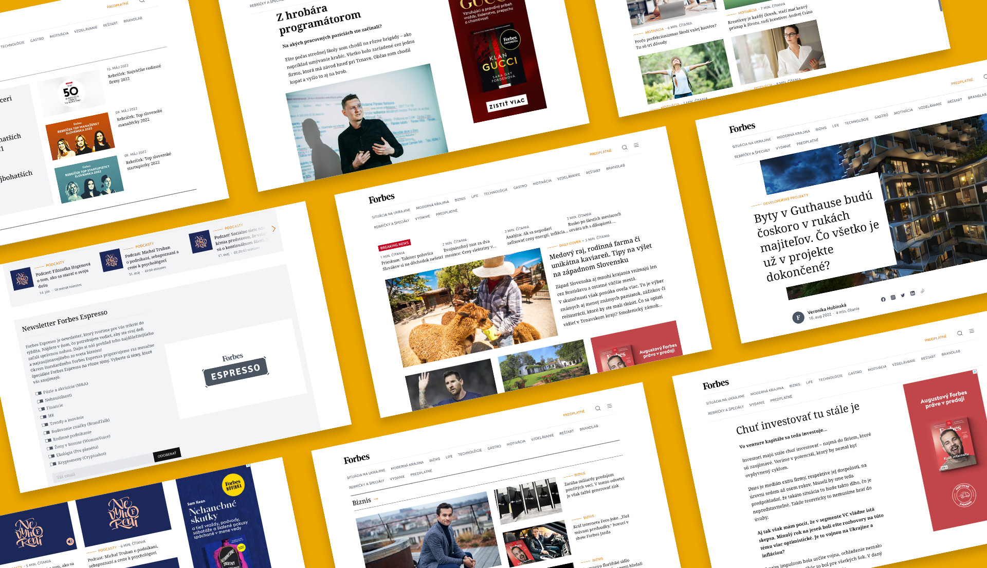
Delivering speed, security, SEO and most importantly: results. We empowered the bold industry leader Forbes with an intuitive, future-proof solution tailored to their business needs.
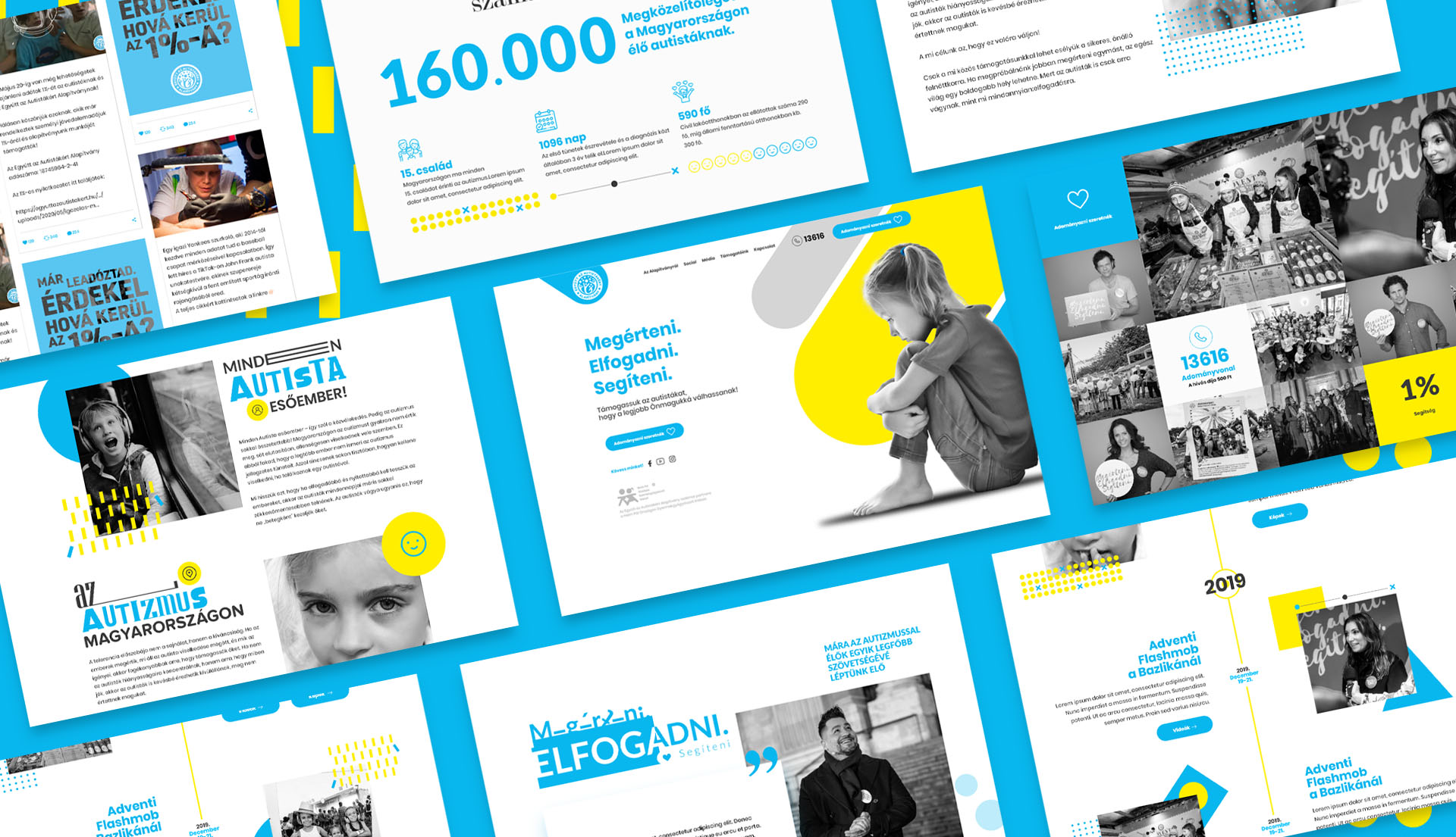
Writing code and developing a website for a good cause has been a sensationally uplifting experience. It gave us a newfound motivation that our work would contribute to raising awareness and helping those living with autism spectrum disorders.